Point & Figure Charts
_________________________________________________________
Point & Figure charts consist of columns of X's and O's that represent filtered price movements over time. Their distinctive look may be alien at first to people who are more familiar with traditional price bar charts but once people learn the basics of P&F charts they usually become hooked.
There are several advantages to using P&F charts instead of the more traditional bar or candlestick charts. P&F charts automatically
- Eliminate the insignificant price movements that often make bar charts appear 'noisy,'
- Remove the often misleading effects of time from the analysis process,
- Make recognizing support/resistance levels much easier,
- Make trend line recognition a 'no-brainer',
- Help you stay focused on the important long-term price developments,
After briefly discussing the history of P&F charting, we'll talk about how to construct a P&F chart by hand. Then we'll discuss how to interpret the most common P&F chart formations.
History
Point & Figure chart analysis has been popular for a very long time. Part of its original appeal was that it was very simple for someone to maintain a large collection of P&F charts back in the days before computers. In less than an hour, using just a pencil, a newspaper and some graph paper, P&F chartists were able to update and analyze 50 or more charts every day. When computers arrived, they made it much easier to create bar charts and P&F charts started to fade in popularity. Recently however, as investors look for better ways to select stocks, Point & Figure charting has been 'rediscovered' and is once again growing in popularity.
This classic paper and pencil-based method was largely put aside as technology made charting easier, and charts became flashier. Now StockCharts.com has reintroduced the Point & Figure chart, adding a dynamic interface that gives you control of the variables.
Creating a P&F Chart
On a P&F chart price movements are combined into either a rising column of X's or a falling column of O's. If you are familiar with standard chart analysis, you can think of each column as representing either an uptrend or a downtrend. Each X or O occupies what is called a box on the chart. Each chart has a setting called the Box Size that is the amount that a stock needs to move above the top of the current column of X's (or below the bottom of the current column of O's) before another X (or O) is added to that column. Each chart has a second setting called the Reversal Amount that determines the amount that a stock needs to move in the opposite direction (down if we are in a rising column of X's, up for a column of O's) before a reversal occurs. Whenever this reversal threshold is crossed, a new column is started right next to the previous one, only moving in the opposite direction.
It sounds much more complex than it is, trust me!
In a nutshell, as long as a stock is in an uptrend and it doesn't move down more than the 'reversal distance' (i.e., the box size multiplied by the reversal amount), the P&F chart will show a growing column of X's. Similarly, a stock in a downtrend will cause a descending column of O's to appear. Only when the stock changes direction by more than the reversal distance will a new column be added to the chart.
Traditionally, the box size is set to 1 and the reversal amount is 3 (however, see below for the gory details).
It is important to remember that a P&F Box does not represent a single value. Instead, it represents a range of values that is equal to the box size. The number on the vertical axis represents the value of the "floor" of the box. The "ceiling" of the box is equal to the floor + the box size. If prices move anywhere inside that range of values, the box is filled in with an "X" or and "O" (keep reading for details).
Constructing a P&F Chart by Hand
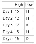
The best way to really understand P&F charts is to create one by hand. All you need is a grid (graph paper is perfect), a pencil, and stock quotes. Only high and low prices are charted - the open and close are ignored. Here are the numbers we'll use for this example:
Key Points Before We Start:
Remember, X's represent increasing prices (AKA demand). O's represent decreasing prices (AKA supply).
You can only have X's or Os in any one column, not both.
The reversal distance is equal to the box size (in this case, one) multiplied by the reversal amount (in this case, three). Therefore, for this example, the reversal distance is three.
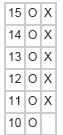
Day 1: High-15 Low-11
To begin, chart the difference between the first day's high and low. Since prices are falling, we'll start with a column of Os.
Day 2: High-12 Low-11
Now watch look for one of two things to happen. First, if the low moves lower by at least the box amount (in this case, one) we mark another O in the same column. Since that didn't happen on Day 2, look to see if the high is higher than the bottom of the current column plus the reversal distance (11+3=14). That didn't happen either. So for Day 2, we do nothing(!).
Note: Doing nothing is a totally acceptable (and common) action to take for a P&F chart.
Day 3: High-12 Low-10
Again, we look to see if the low moves lower by at least the box amount. It does. So we add another O to the column. (If the low had moved down two points, we would mark two O's.)
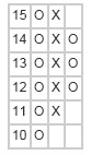
Day 4: High-15 Low-11
Since we're still in a column of O's, we check the low first. It does not move past the previous low, so we do not add another O. Then we see if the high was greater than or equal to the bottom of the column plus the reversal distance (i.e., 10+3=13). Since the high was 15, that means that the chart did reverse and we add five X's starting one above the low of the previous column.
Day 5: High-15 Low-12
Now we're in a column of X's, so we check the high first. It did not move up by a full box, so we next check the low. Since the low has moved down to the reversal threshold (i.e., the top of the column minus the reversal distance (15-3=12)), we reverse one more time and add three O's to the next column.
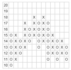
Over time, our chart might look something like this:
Is it important to remember that P&F charts do not show time in a linear fashion. Each column can represent one day, or many days, depending on the price movement. Because P&F charts filter out the noise associated with more traditional charting methods, every mark on the chart is significant.
Simple P&F Chart Patterns
At the most basic level, there are four things to look for:
- Support levels
- Resistance levels
- Upward trend lines
- Downward trend lines
Support and resistance are defined in more detail in our glossary. Because of the nature of P&F charts, support and resistance levels are always horizontal lines and trend lines always appear at 45° angles.
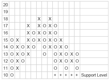
Support Levels
Support levels indicate the price at which most investors feel that prices will move higher. There is sufficient demand for a stock to cause a halt in an downward trend and turn the trend up. You can spot support levels on P&F charts by looking for a horizontal row of Os that each mark the bottom of their respective columns.
When a support level is penetrated (the price drops below the support level) it often becomes a resistance level; this is because investors want to limit their losses and will sell later, when prices approach the former level.
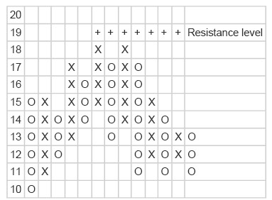
Resistance Levels
Like support levels, resistance levels are horizontal lines on P&F charts. They mark the upper level for trading, or a price at which sellers typically outnumber buyers. Find them by looking for a row of X's.
When resistance levels are broken, the price moves above the resistance level, and often does so decisively.
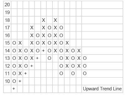
Upward Trend Lines
To plot an upward, or support, trend line, first put a + under the first column of Os.
Then move over one box and up one box and draw another +. Repeat this until you hit another column of Os followed by a row of X's which does not continue the pattern.
The upward trend line indicates the point where buyers start to outnumber sellers.
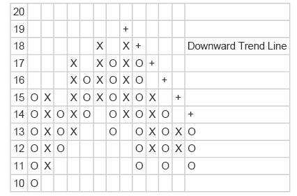
Downward Trend Lines
Now our stock has turned a corner. Let's look for a downward trend line. Start at a wall of X's, and use the same plotting technique as before, but at a downward angle. Remember, trend lines always appear at a 45° angle.
Confirmation
Both support levels and resistance levels should be confirmed by volume. If volume increases after a breakout, most people agree with the new direction.
P&F Chart Patterns
Because P&F charts are less "fuzzy" than OHLC Bar/Candlestick charts - i.e., a box is either filled or it isn't - a series of well-defined P&F Chart Patterns exists that can help people interpret P&F charts. Here is a link to a list of most Common P&F Chart Patterns
P&F Price Objectives
A Point and Figure Price Objective is a simplistic calculation that indicates the price that a stock should reach based on recent P&F chart signals. Here is a link to an article with more details on P&F Price Objectives.
--------------------
Remember, P&F charts do not show time linearly, so the spacing between months, for example, will not be the same from month to month. Numbers and letters inside the chart itself indicate when a new month has begun. For instance, the number '2' shows where February started. The letters 'A', 'B', and 'C' are used to indicate October, November, and December.
Related Topics

----------- EDUCATION ---------
-------TRADING METHODS ------
--------- FOR TRADERS ---------
-------------- OTHER ------------

_________________________________________________________________________________________________________________________________________
Do you like fx1618?
If you think fx1618.com is cool and want to help fx1618, please tell your friends about it via email and blog (or forum)